This is an ideas page:
You may want to present information through websites and visual formats. Here are some ideas for you to consider and at the end some ideas on to make your website look good.
A website is a collection of webpages, the same as a blog. The only difference is a blog has a blog section, normally this is in date order. But you can make static pages as well, which can be accessed through a navigation bar. If you want good reviews for the software I have listed below (or any other web design software) you can find them on this website.
In you want further ideas here is a link to the 15 Best Website Builders in 2018
WordPress
This and Blogger are the two blog sites that I would recommend.
+ Easy to use and set up. Great for simple layouts
– Hard to make the layouts more interesting on a page
Wix
+ Easy to set up and use. Free to use. Great features to change the layout and formats of your pages.
– Can be slow to load.
Weebly
IMCreator
+ Easy to set up. Free to use. Great features
– Can not change a template without starting over again
You should also make sure that you website looks good. Think about the…
Layout:
Chunk Down:
Have a look at these two pieces of text. The content is the same. Which do you find more visually appealing?
Normally we like the text that has been “chunked” into smaller sections. It makes it easier for us to read.
(if you ever need to have some random text use Lorem Ipsum to create it!
Size:
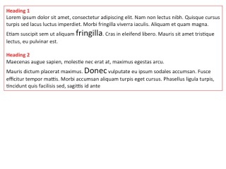
Size matters. Our eye is normally drawn to the biggest item (text image…). We see that as the most important thing. On here Blogging Techniques is important I have therefore made it a heading (larger than the other text. Look at the image below. What do you see first?
I suspect:
Fringilla, Donec
and then
Heading 1 and Heading 2 as they are a different colour
Colour & Contrast:
Lots of colours will make you feel the audience feel nauseous, it will make your page look unprofessional and hard to read. Don’t believe me take a look at this
However some colour makes it interesting. Think about the colour – here is a colour wheel that might help. How do you want people to feel? I use red on this page as it “jumps” out of the page and shouts at the audience.
You can also use contrast by changing the background colour or adding a coloured border. Think how do I want to use the colour of the text, headings, borders, background, important information?
Alignment & Spacing:
Where we put “stuff” matters as your eyes will get drawn to certain areas. For example I have placed images left, right and centre each for a different reason.
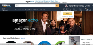
Where does your eye go first?
White space can be useful. Use it as a creative tool to walk your audience through your work. Too much can be disturbing too little and it looks cluttered. Think – What would I like to see? What would I read?
Good luck with developing your website. If you use a piece of software not on this list please tell me about it in the comment section. I would love to keep updating this page.


